
ROLE IN PROJECT:
Product Designer
PROJECT YEAR:
2025
WORK DONE:
UX Strategy / Onboarding / Branding
OUTCOME:
12% lower parent drop-off / 100% positive sitter feedback
As Busy Bees scaled, both parents and babysitters experienced confusing onboarding and unclear trust signals. This created friction early in the experience, leading to drop-off at critical moments and putting activation and conversion at risk.
If Busy Bees could reduce onboarding friction and improve clarity without overhauling the entire product, then the team could increase activation and conversion while creating a more scalable starting point ahead of future funding and team growth.
Audited first-time user experience to identify activation drop-offs
Prioritized onboarding clarity over feature exposure
Reduced steps and introduced hierarchy to accelerate “first win”
Built a lightweight design system so a non-product team could iterate faster

Busy Bees had updated brand guidelines from an outside studio but nothing to apply them consistently across the product. We translated it into a Figma design system so the team could build without breaking.

Usage data showed which profile fields parents actually completed. We removed the rest and restructured the hierarchy around what drove booking decisions.

Babysitters already had scheduling and rate information in their profiles. The job view was rebuilt to surface it automatically instead of requiring redundant input.
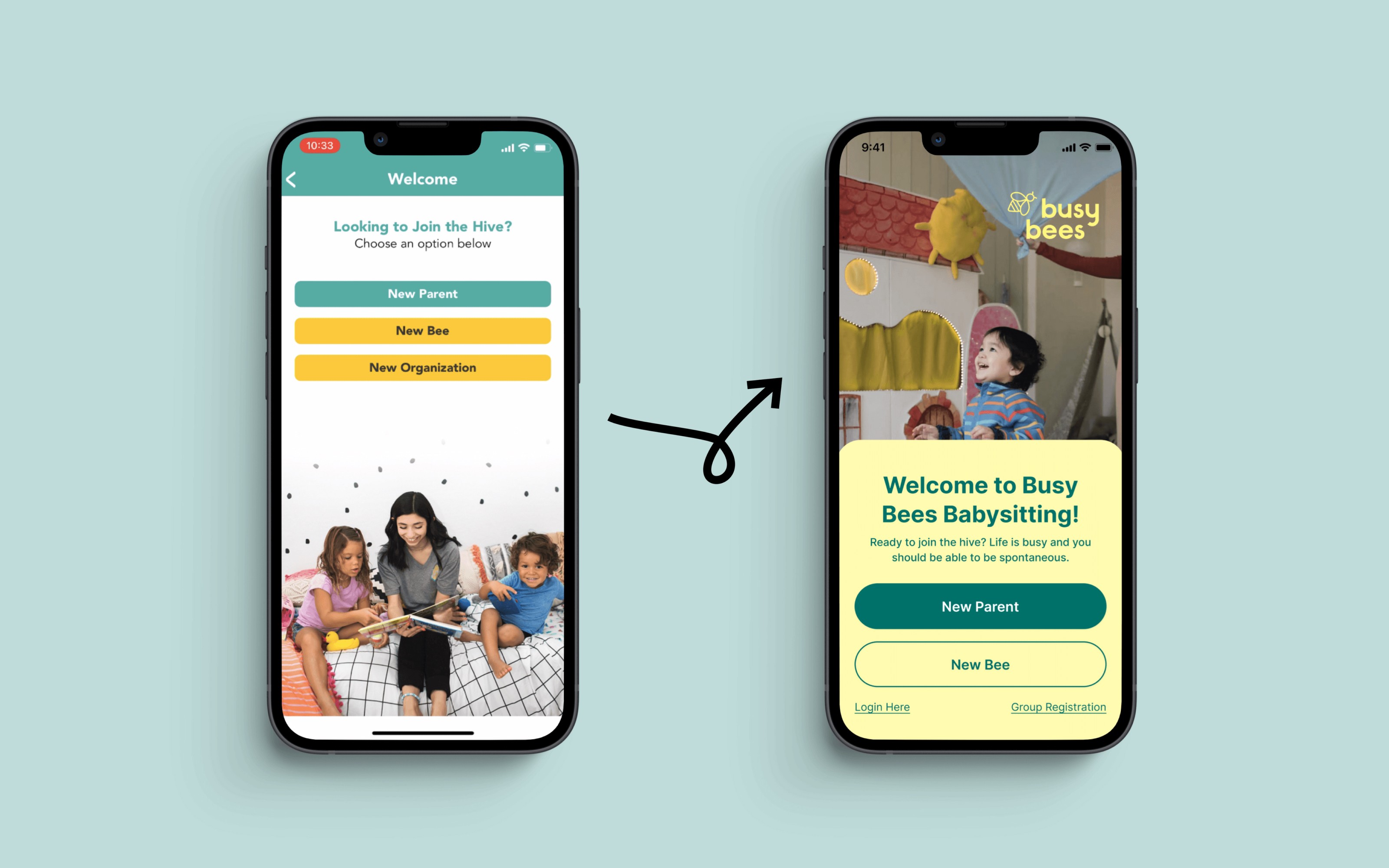
Three entry points confused new users before they ever created an account. Consolidating splash, welcome, and login into a single screen reduced early drop-off immediately.
PARENT ONBOARDING FLOW REDUCED DROP-OFF BY 12%
The parent onboarding flow was reduced by 9%, resulting in a 12% decrease in user drop-off and an increase in paid conversions.
CONSOLIDATING ENTRY POINTS DROVE 100% POSITIVE SITTER FEEDBACK
After addressing feedback describing the original experience as “annoying” and “frustrating,” post-launch testing resulted in 100% positive feedback from babysitters.