
ROLE IN PROJECT:
Product Designer
PROJECT YEAR:
2022
WORK DONE:
UX Strategy / Journey Mapping / Flow Redesign / Interaction Design
OUTCOME:
81% fewer pages / 16% faster quotes / 5% fewer support calls
The bundled home and auto quote flow had high drop-off due to excessive manual input, duplicated questions, and a fragmented experience across multiple flows. Customers struggled to complete the process, delaying quotes and increasing support burden.
By reducing the length of the buy flow and introducing pre-fill elements, customer conversion would increase, time to quote would decrease, and overall frustration would be reduced.
Audited the full bundled quote journey to identify friction and redundancy
Designed simplified architecture flows to align stakeholders on experience changes
Prioritized reducing page volume and manual entry before adding new features
Planned fallback paths when third-party pre-fill data was unavailable
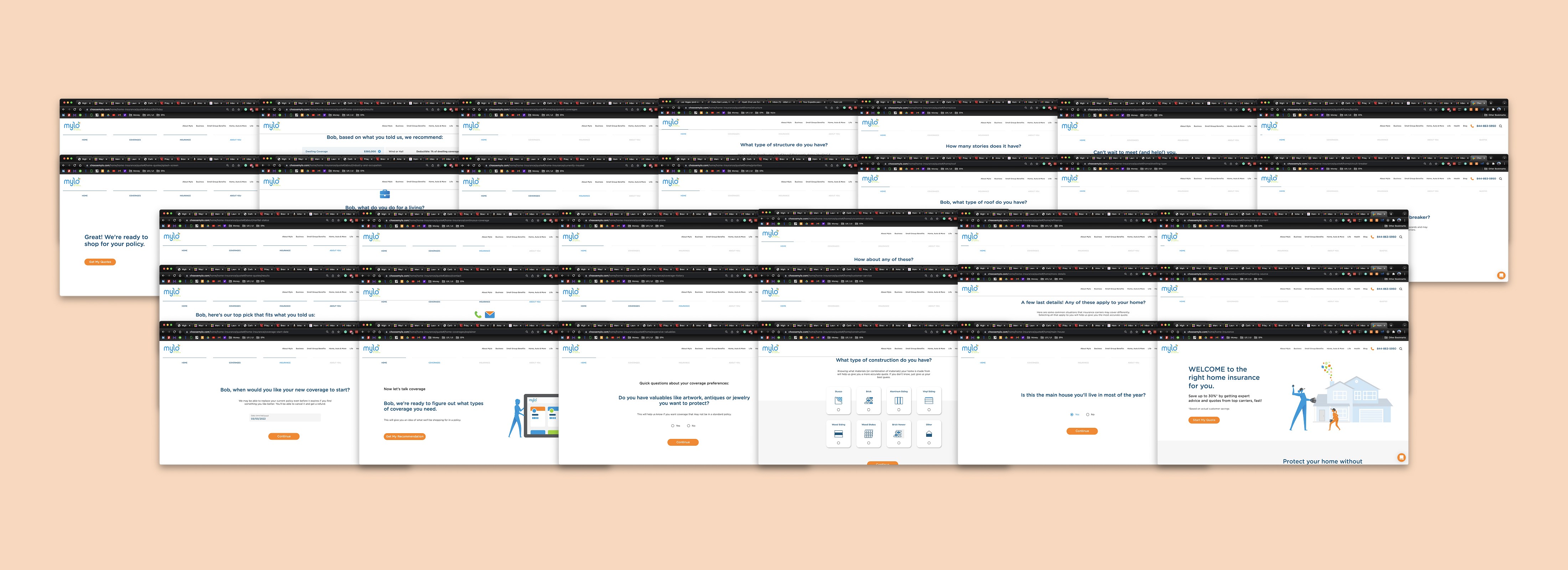
Auditing the existing flow exposed excessive page volume, personal information required too early, and duplicate questions across home and auto. We documented everything before proposing a single change.

Pre-fill surfaced customer data automatically to reduce manual entry — but we built an explicit opt-out for users uncomfortable with data pulls, and a full fallback for when Mylo's budget suspended the feature entirely.
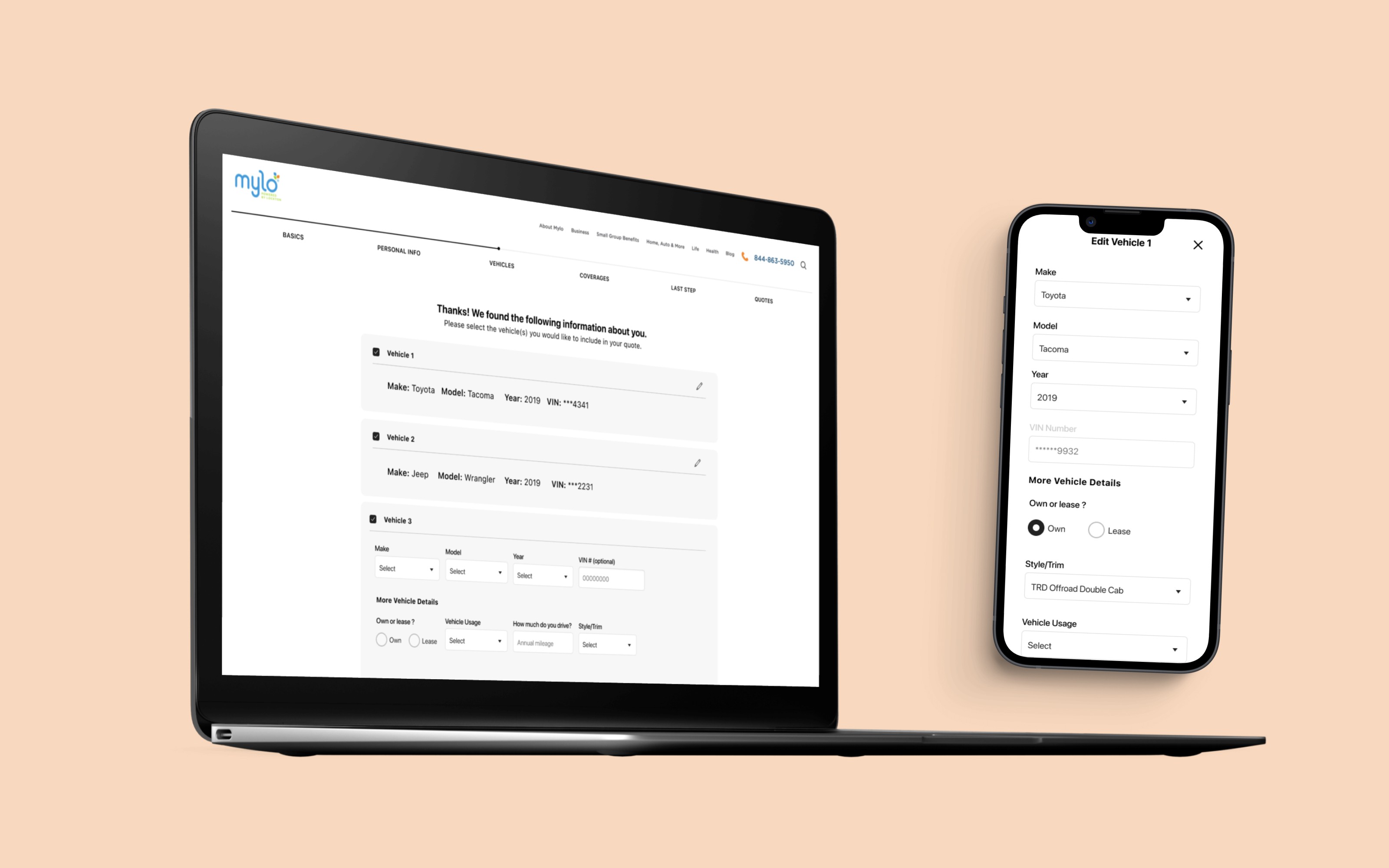
Multi-vehicle quick select let users confirm pre-filled vehicle data in one step instead of re-entering it manually — the biggest single reduction in input friction.
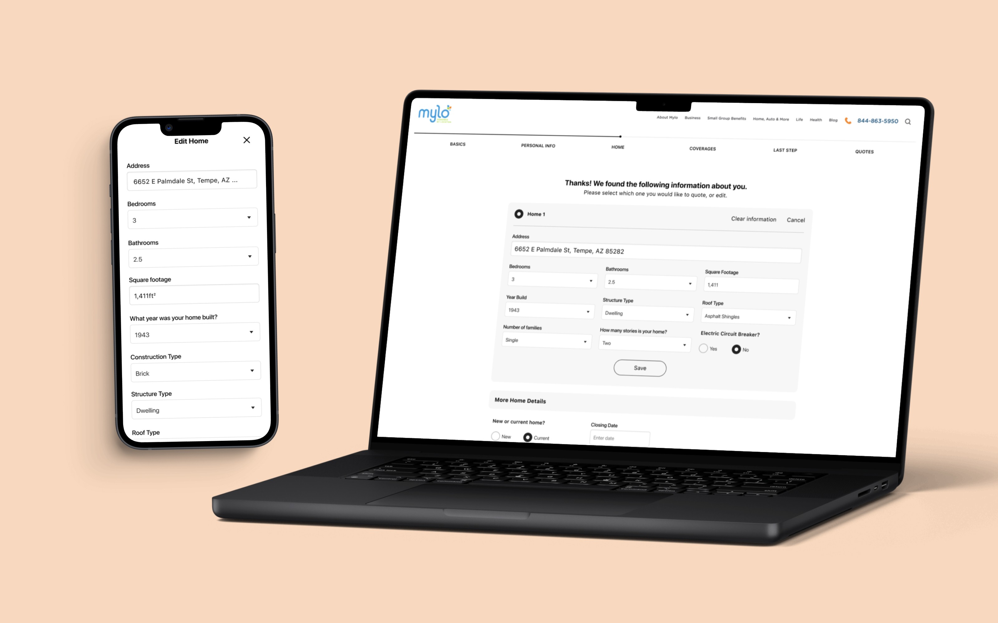
We removed optional questions, hid fields that didn't apply, and surfaced pre-filled home data for quick review. Users could confirm or correct — not re-enter from scratch.

The final experience unified home and auto into a single bundled flow. Pre-fill, reduced pages, and multi-car quick select all built on top of this structural decision.
Reducing page volume in the quote flow
Eliminating duplicated questions and merging two separate flows into one cut the experience from 32 screens to 6 — an 81% reduction. The biggest gains came from pre-fill, removing manual entry steps that had no business being in the critical path.
Faster time to quote
With fewer screens and less manual input, customers reached their quote 16% faster. That speed improvement was a direct result of the decision to reduce before we added — we didn't layer new features onto a broken flow.
Support call reduction
Agents spent 5% less time chasing missing information post-quote. Pre-fill surfacing accurate customer data upfront meant fewer gaps that required a follow-up call to close.
Stakeholder impact
The redesign delivered on Mylo's original scope and made the case for UX investment internally, so Mylo increased the UX budget and continued our partnership for additional projects.