
ROLE IN PROJECT:
Product Designer
PROJECT YEAR:
2026
WORK DONE:
Launch Experience / Checkout Flows / Visual Design / Member Experience
OUTCOME:
Delivered a product launch across discovery, redemption, and checkout.
With a compressed launch timeline already in motion, Seed faced branding inconsistencies across discovery, member flows, and checkout that risked creating confusion and a fragmented customer journey during a high-visibility product release.
Applied refreshed branding across PLP and PDP surfaces
Refined checkout and confirmation flows to support conversion
Designed presale redemption experiences for members
Created launch assets including banners, teasers, and member communications
Executed rapidly under tight timeline constraints
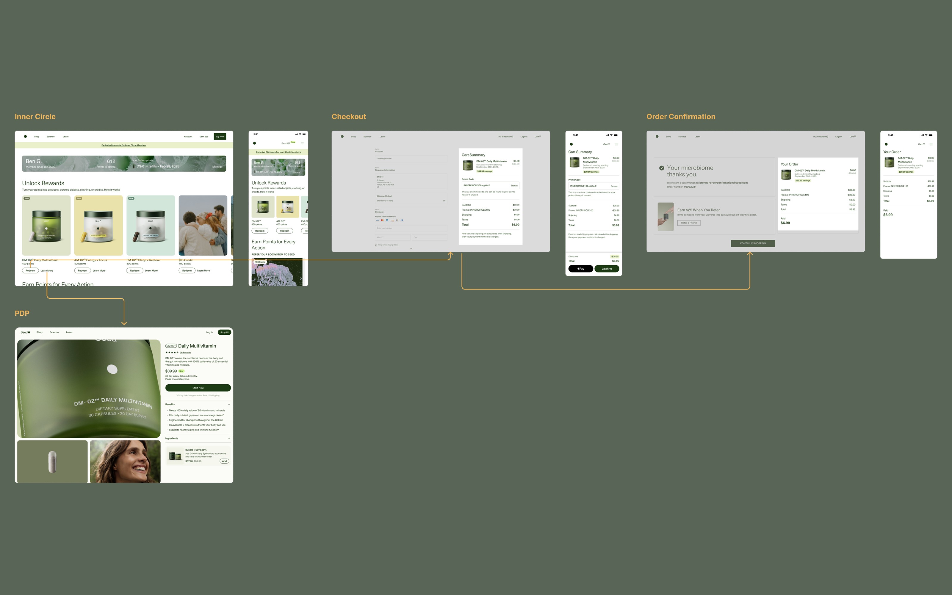
Discovery, redemption, and checkout each told a different visual story. Mapping the full launch flow exposed where inconsistency would create the most friction during a high-visibility release.
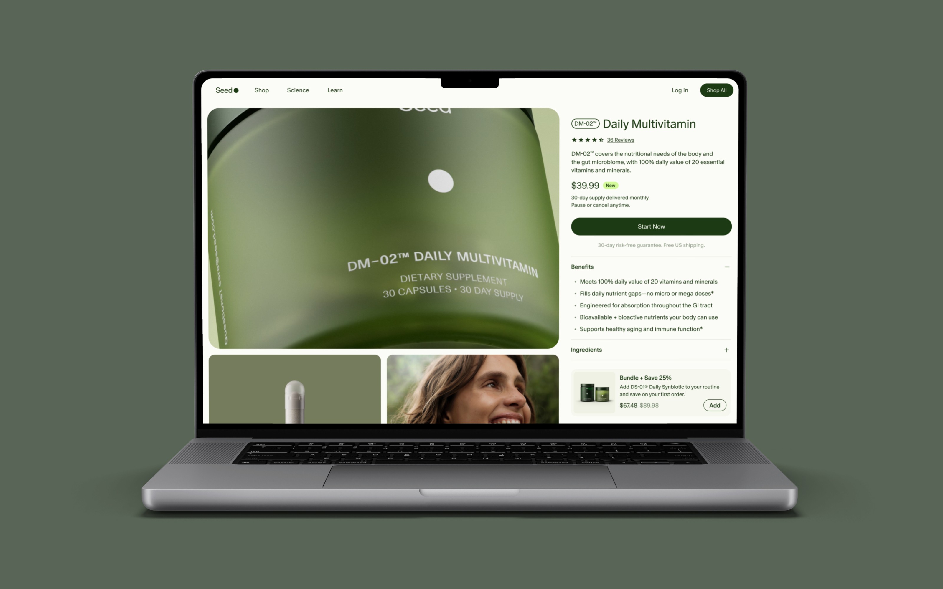
The PLP and PDP carried the heaviest traffic during launch. Refreshing hierarchy, typography, and visual consistency here reduced the risk of drop-off at the highest-stakes entry point.
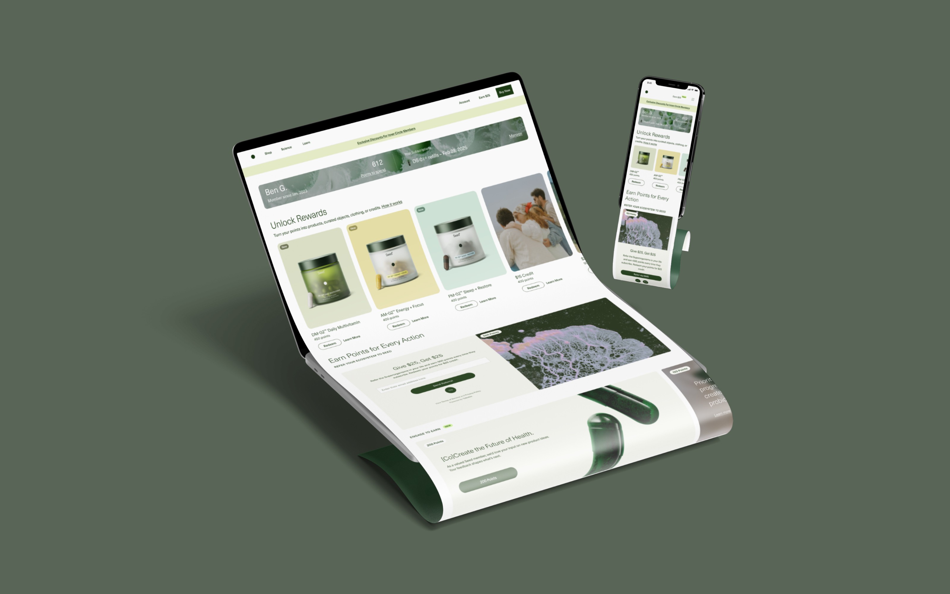
Inner Circle pre-sale access was a loyalty driver. Aligning the redemption experience with the premium feel of the brand reinforced the value of membership at the moment it mattered most.
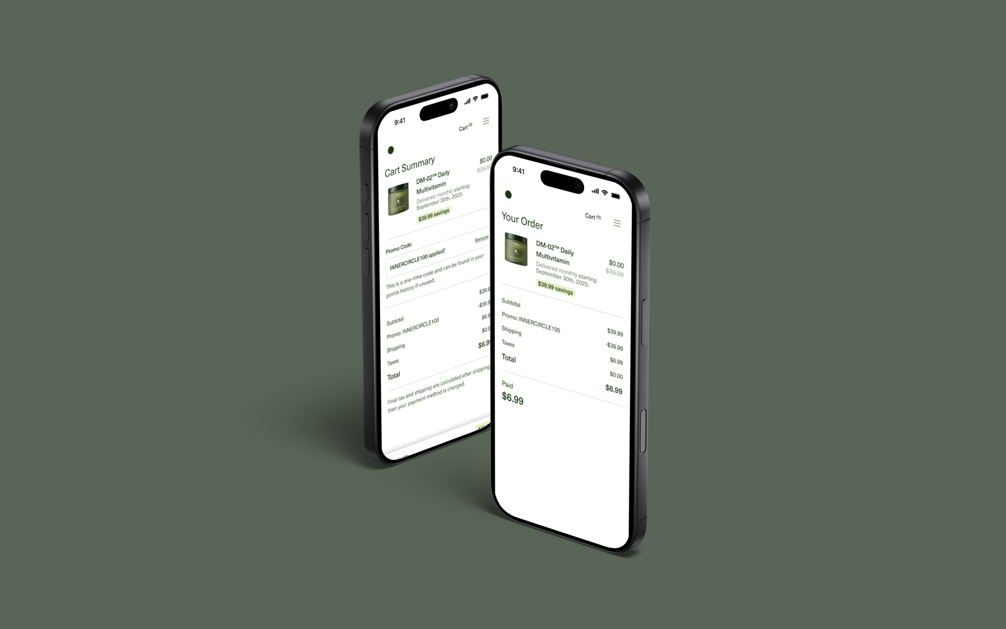
Mobile purchase flow was streamlined to carry the refreshed visual system through to order confirmation, ensuring the customer journey felt cohesive from first touch through completed purchase.
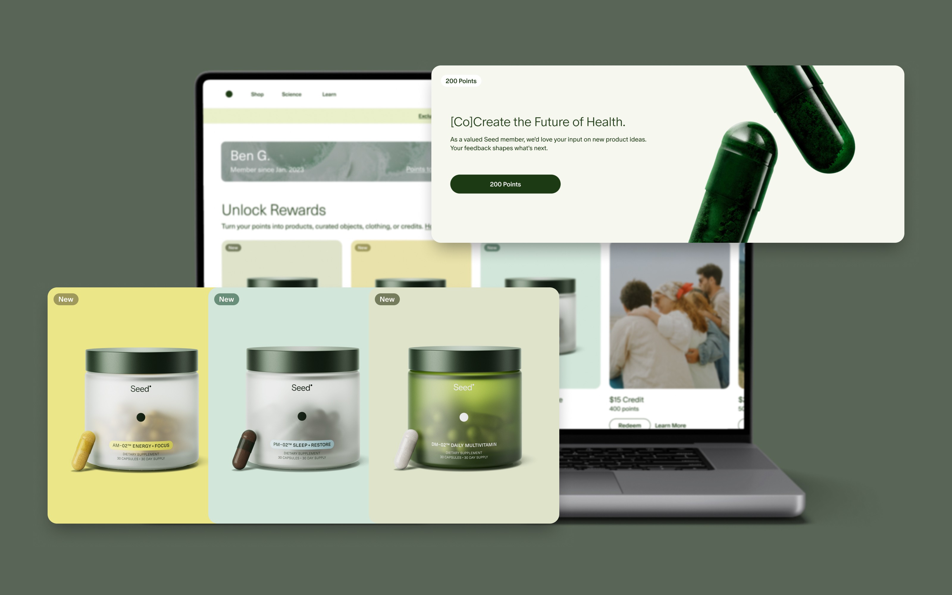
Rewards, product previews, and member communications were unified under the same visual language, ensuring every touchpoint reinforced the Seed brand during the highest-traffic period of the year.
LAUNCH SHIPPED ACROSS ALL TOUCHPOINTS ON SCHEDULE
Discovery, redemption, and checkout experiences were aligned under a unified visual system and delivered within a compressed timeline, supporting a high-visibility product release without delay.
VISUAL CONSISTENCY REDUCED CUSTOMER JOURNEY FRAGMENTATION
Branding inconsistencies across web and mobile were resolved before launch, ensuring customers moved from product discovery through checkout without encountering conflicting visual signals.
MEMBER REDEMPTION EXPERIENCE REINFORCED BRAND PREMIUM
The Inner Circle pre-sale flow was elevated to match the Seed brand standard, strengthening the perceived value of membership access at the moment of highest engagement.